Add a 12-Column Grid
Twelve column grids are a super flexible layout style for combining uniformly placed elements with details that break out of their columns. The number 12 is quite flexible, being divisible by 2, 3, 4, and 6, making it ideal for responsive web grids, or any scenario where one expects to have to frequently change the number of columns that content is constrained to.
-
Navigate to the Grid tab.
-
Select your document, page, artboard, or an object. This will work anywhere.
-
In the Columns section, enter
12in the quantity field.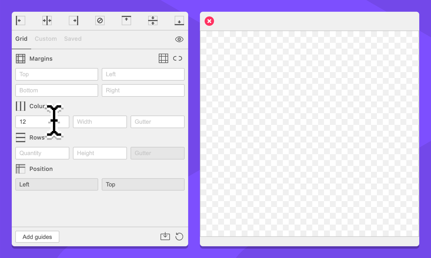
-
In the Columns section, enter
20px | ~ | 20pxin the width field.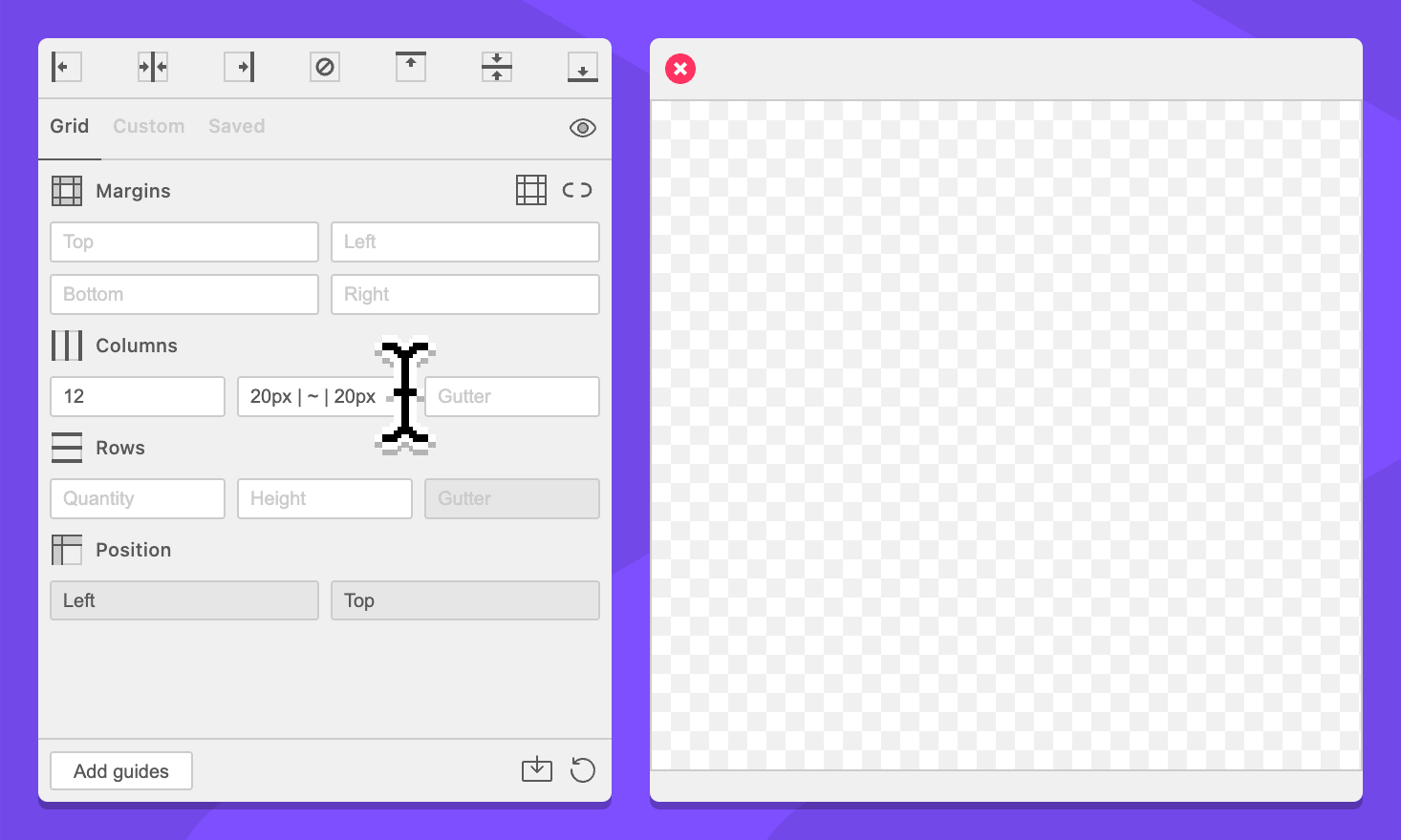
-
Click the Add guides button.
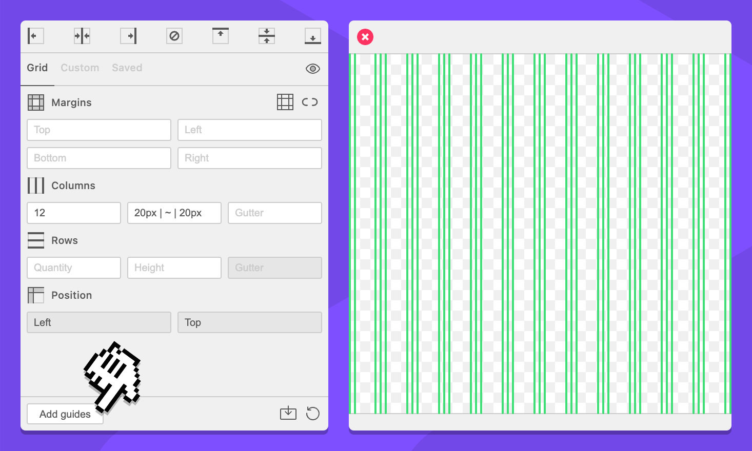
The column count probably makes sense, but the column width might look a bit complicated. We added Grid Notation, a syntax that GuideGuide uses to “write” grids. 20px | ~ | 20px says “make a section 20 pixels wide, add a guide, figure out the width for me, add a guide, and make another section 20 pixels wide.”
Under the hood, GuideGuide counts all of the ~ commands (in this case there are 12 of them) and then divides the unclaimed space equally between them. The result is twelve columns, each with a right and left margin that is 20 pixels wide.