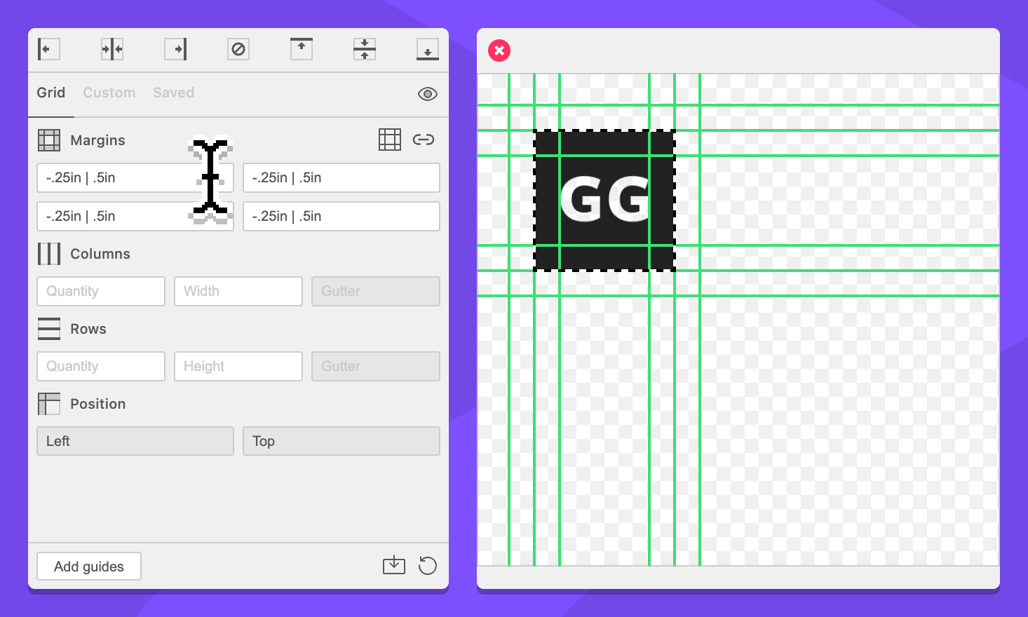
Add Clear Space
Clear space is the concept of adding negative space around an object — often logos — to prevent them from interacting with other design elements. This concept can be tricky for grid tools because they typically create margins “in” from the selected area, but clear space is a measurement that is “outside” the selection. GuideGuide can do this easily with negative margins.
-
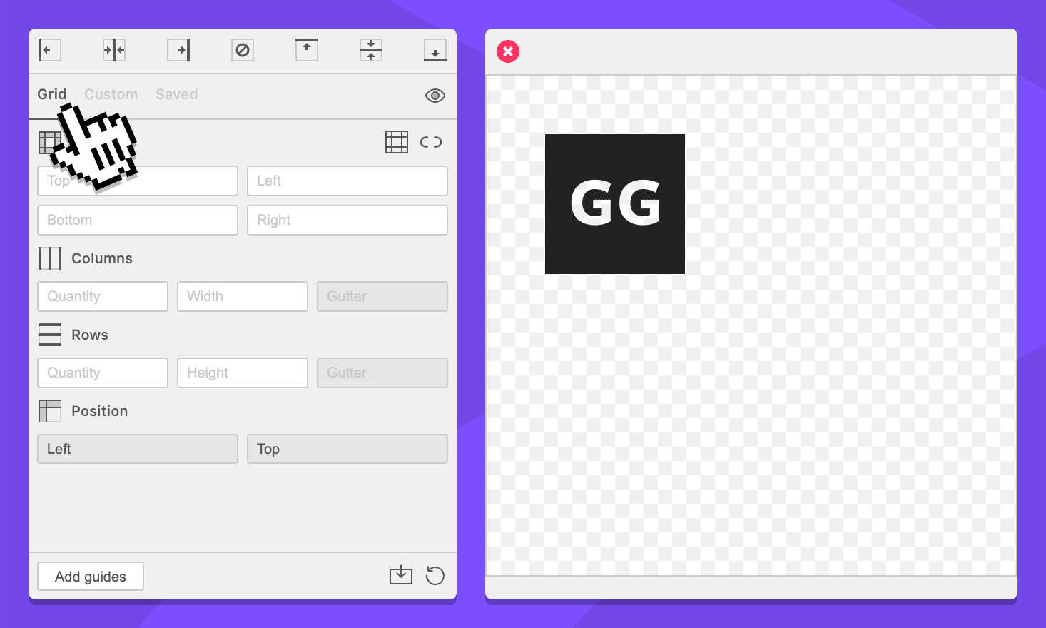
Navigate to the Grid tab.
-
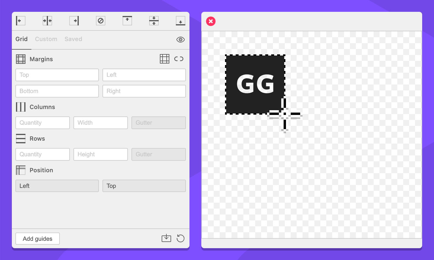
Select something in your document.
-
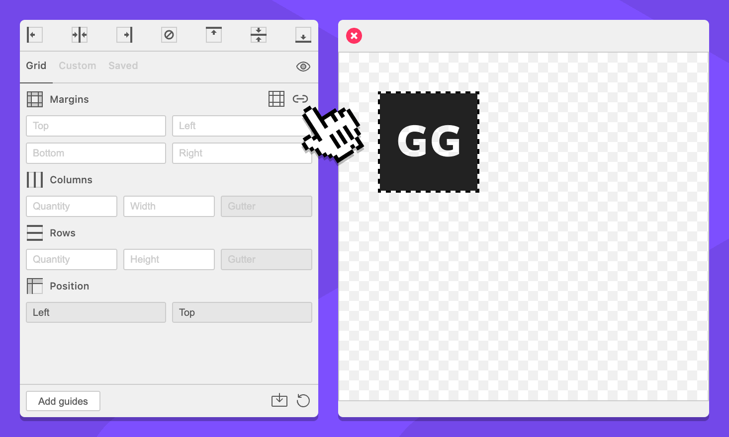
In the Margins section, make sure the Sync margin fields icon looks like a link .
-
In the Margins section, enter
-.25inin any margin fields. They will all update.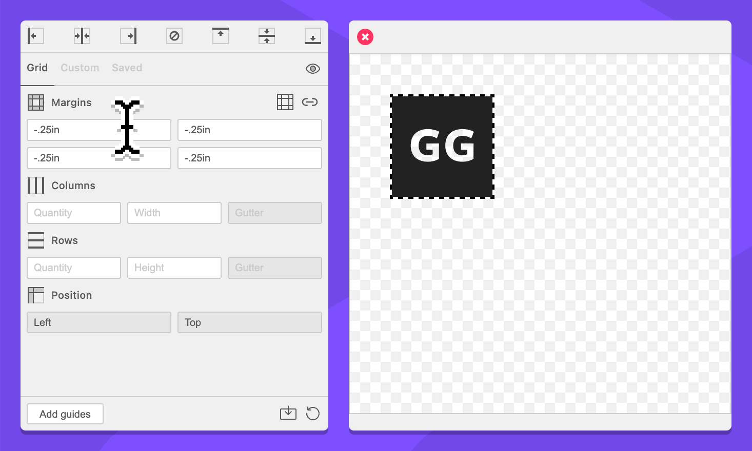
-
Click the Add guides button.
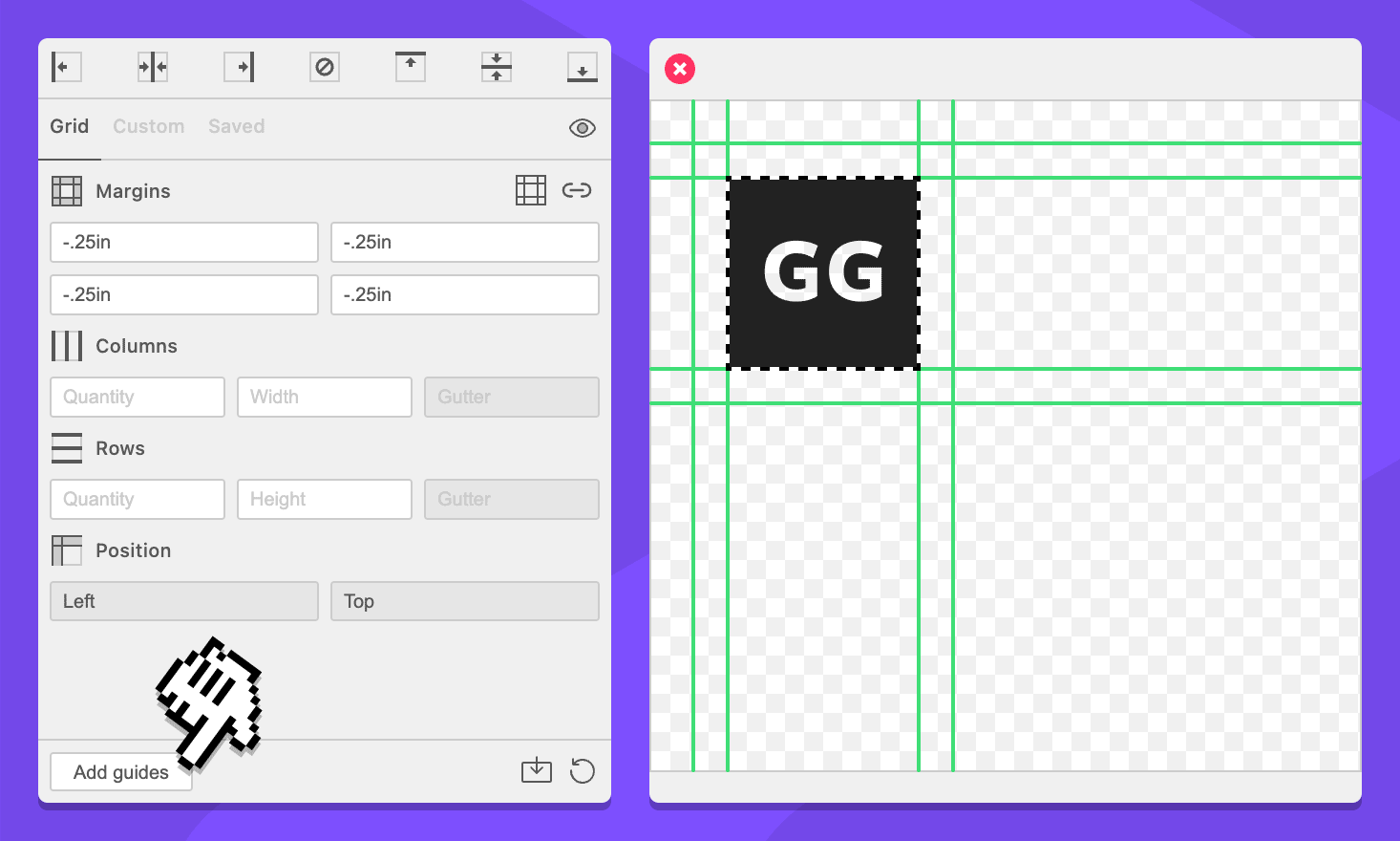
You now have guides that create a quarter inch margin around your selected logo that can be used to assist with placement and spacing.
We created this by using a negative value. GuideGuide commands essentially say “move the place where you will put the next guide over this far”. This typically goes from left to right, but negative numbers will move in the opposite direction.
To illustrate this, you can try adding -.25in | .25in instead. This will look exactly the same because the GuideGuide moves out, places a guide, then moves in and places a guide back where it started.
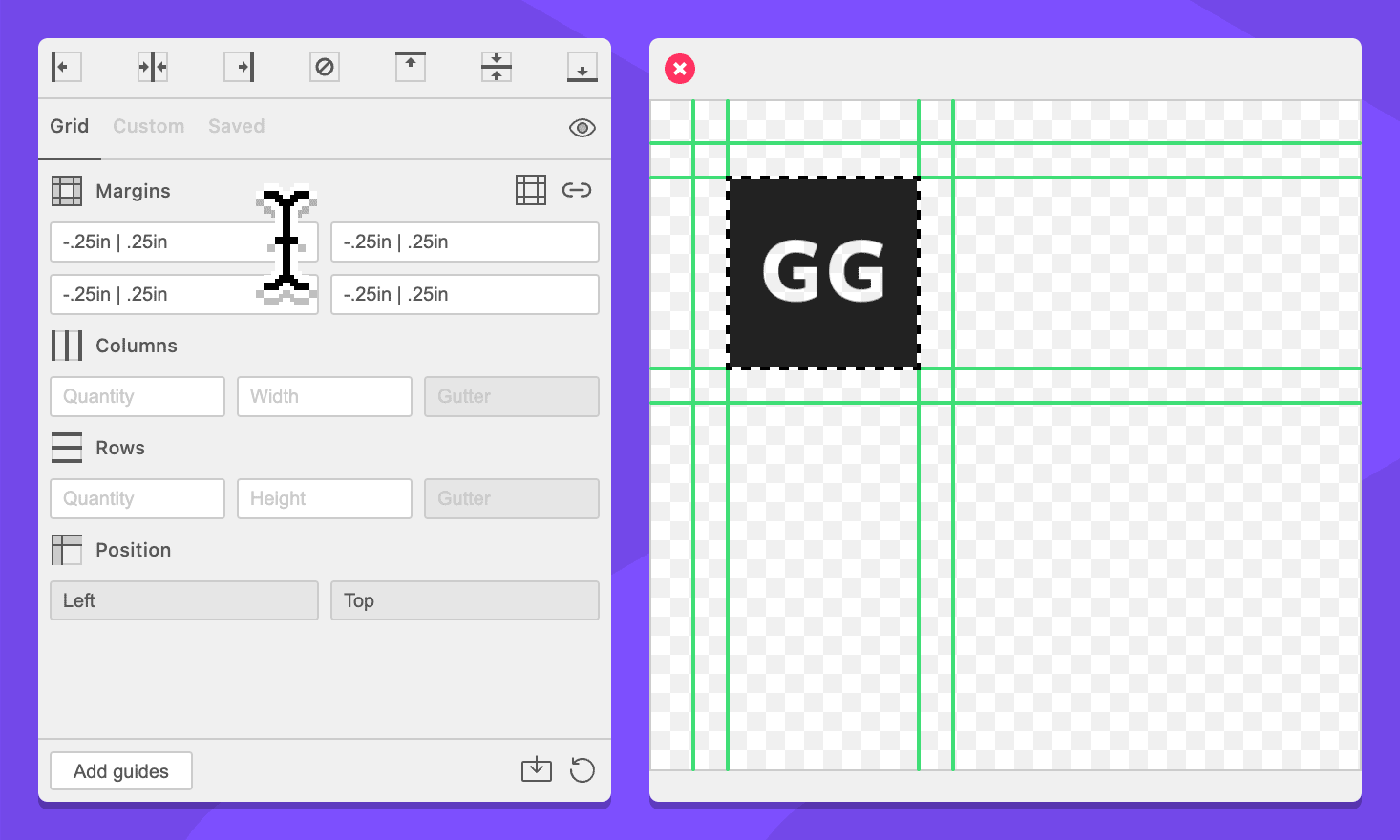
If you change it to -.25in | .5in you will get guides for a margin that is a quarter inch outside and a quarter inch inside your selection.
