The Grid Tab
The Grid tab contains a form you can use to generate a grid using familiar concepts like columns, rows, gutters, and margins using all of the unit types you are familiar with.
Every field is optional. If you omit a value that is required for calculating your grid, GuideGuide will automatically determine its value.
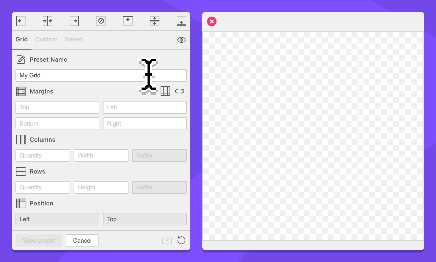
Preset Name
This section only appears while creating or editing a preset.
Field: Name
Assign a name to the preset that is being created or edited.
Margins
Field: Top Margin
Specify a top margin for the grid.
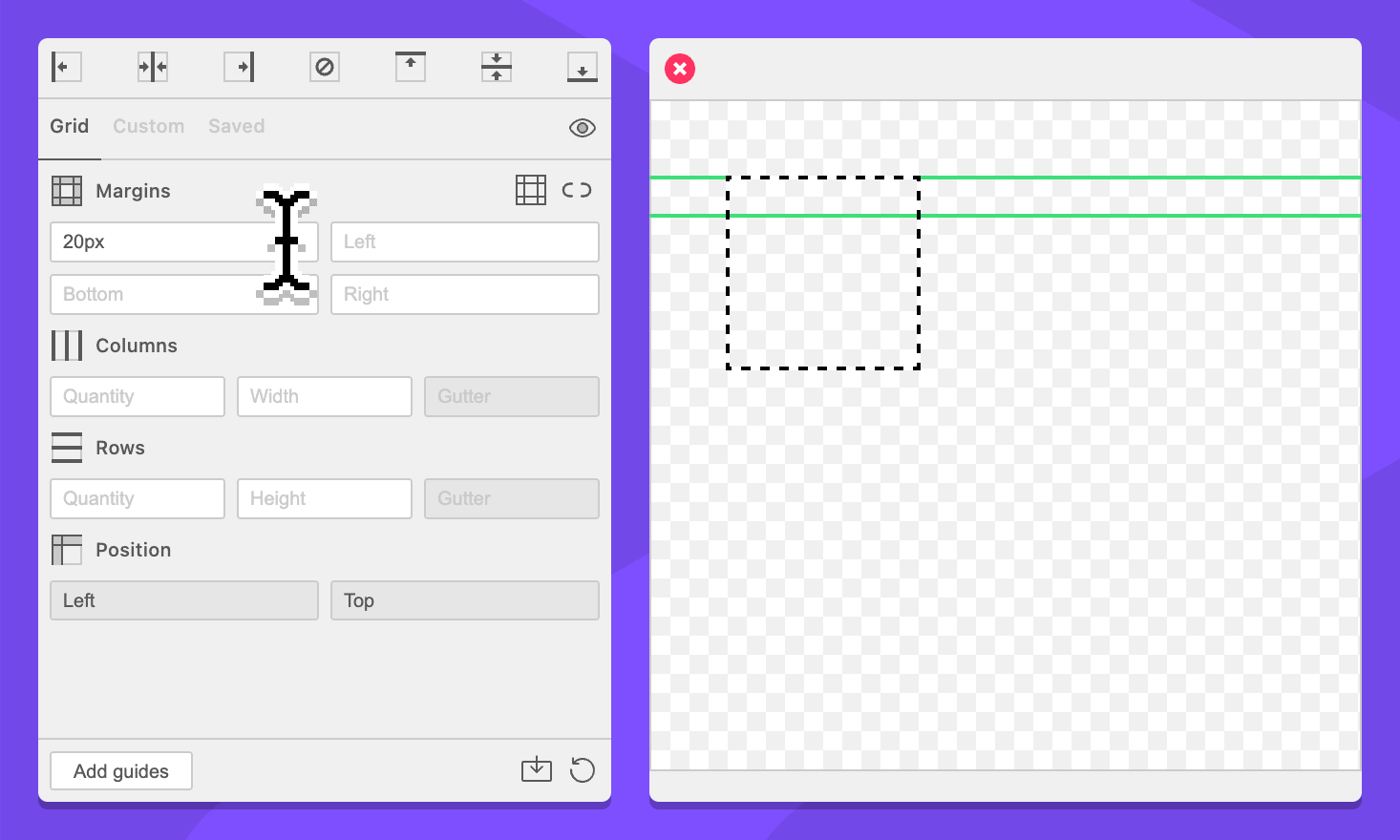
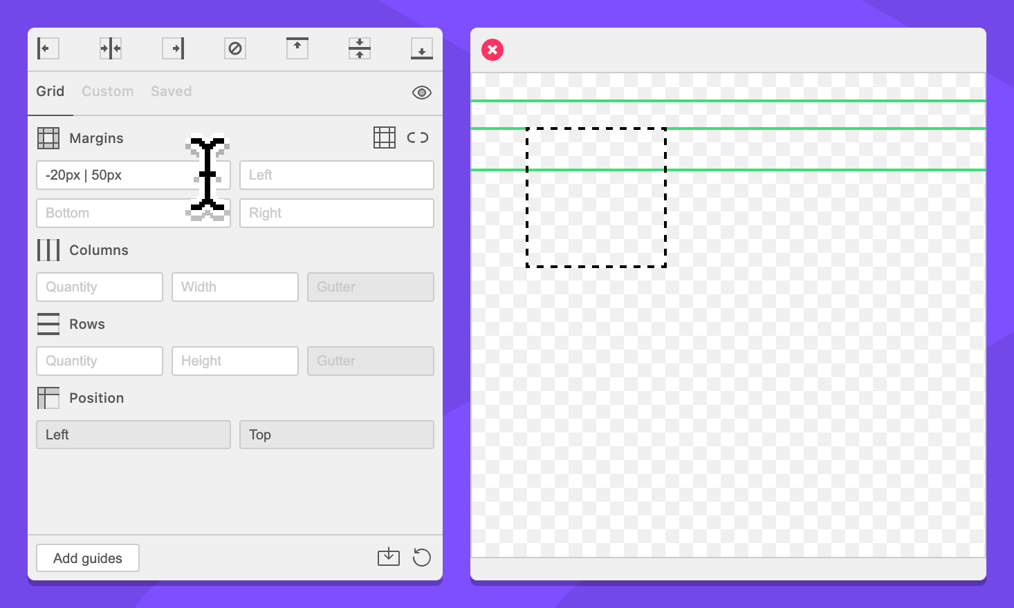
This field supports negative values and simplified grid notation. Commands are interpreted top to bottom.
Field: Left Margin
Specify a left margin for the grid.
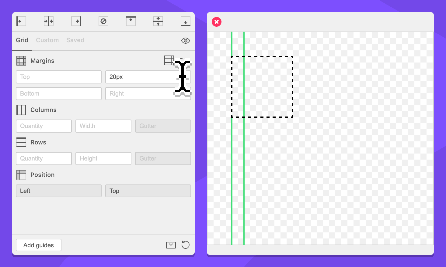
This field supports negative values and simplified grid notation. Commands are interpreted left to right.
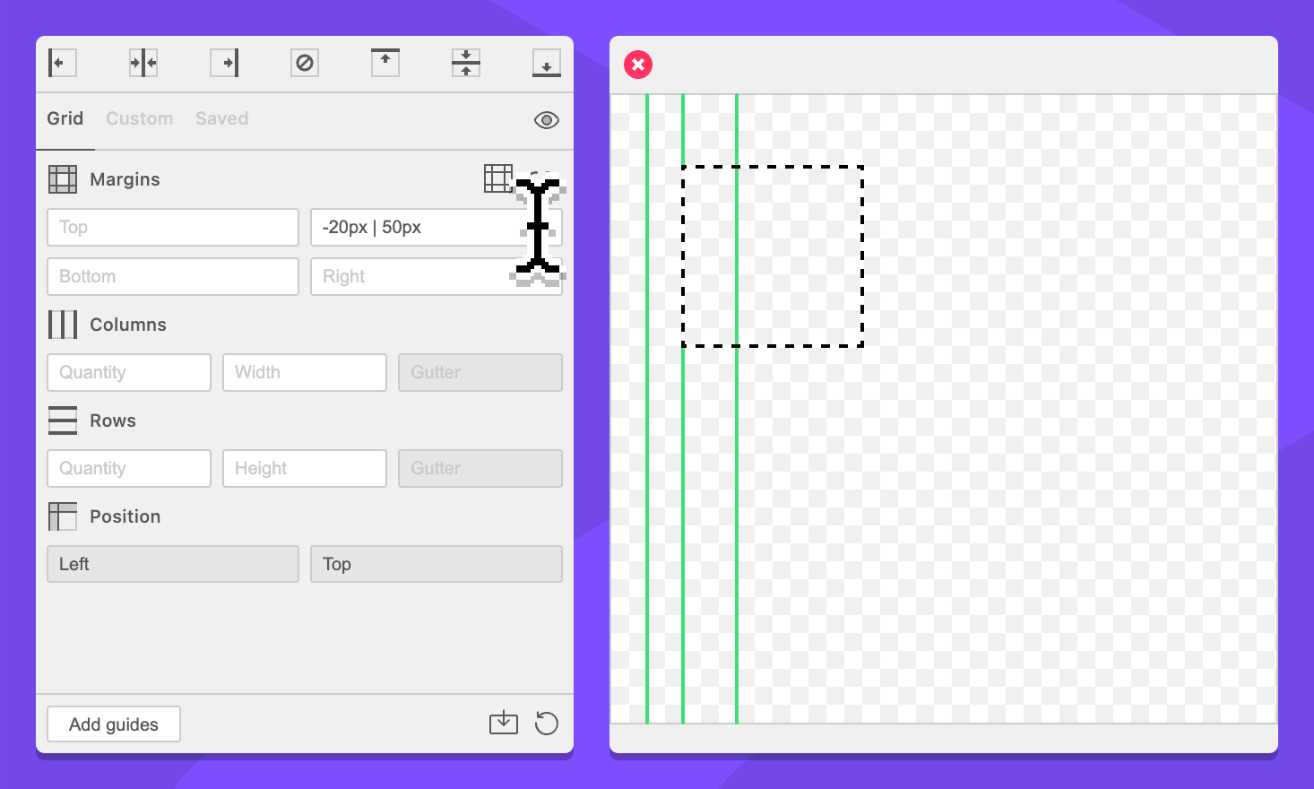
Field: Bottom Margin
Specify a bottom margin for the grid.
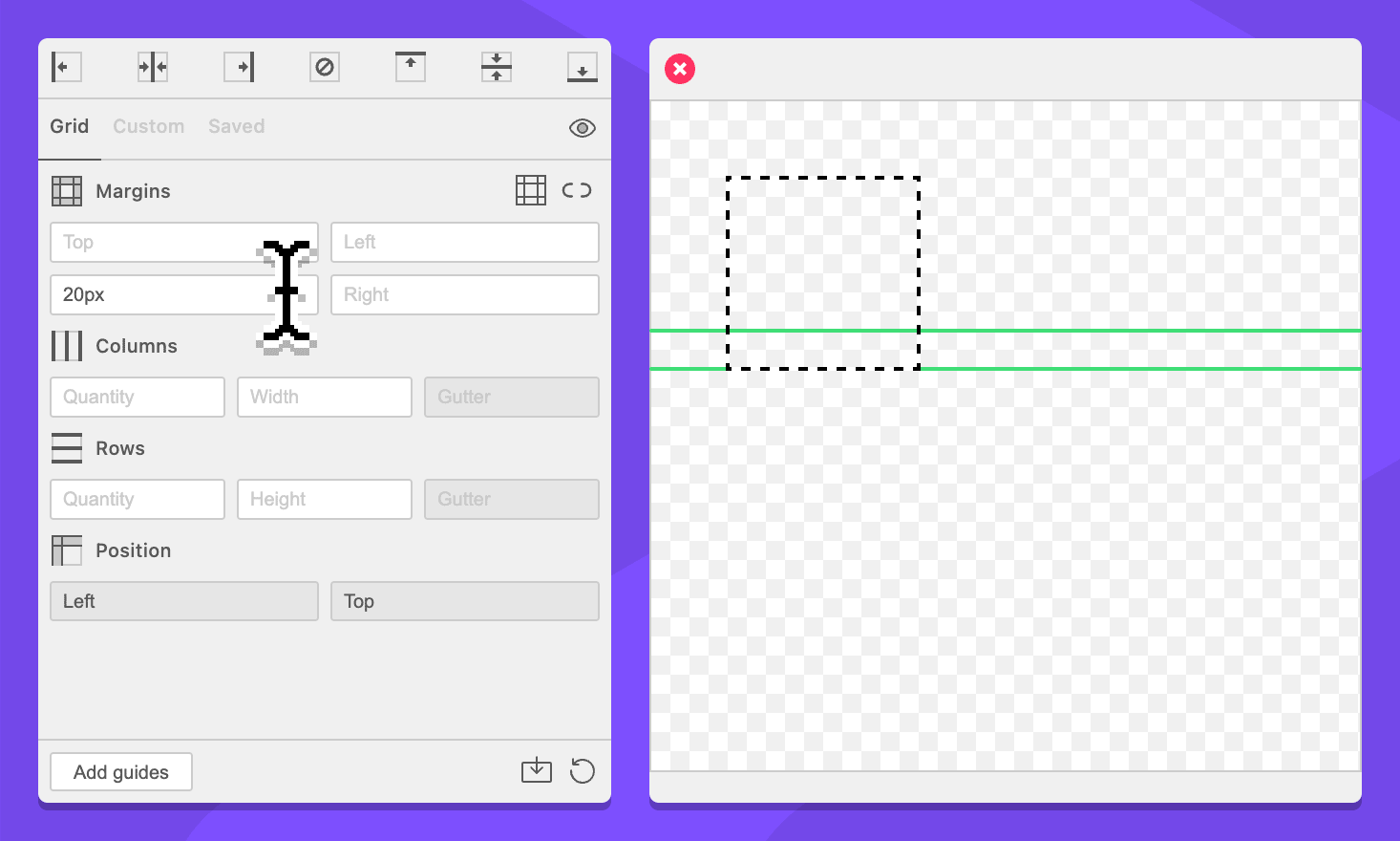
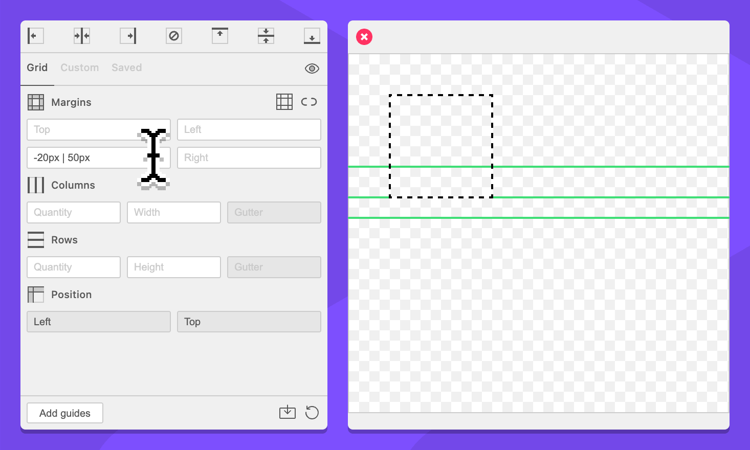
This field supports negative values and simplified grid notation. Commands are interpreted bottom to top.
Field: Right Margin
Specify a right margin for the grid.
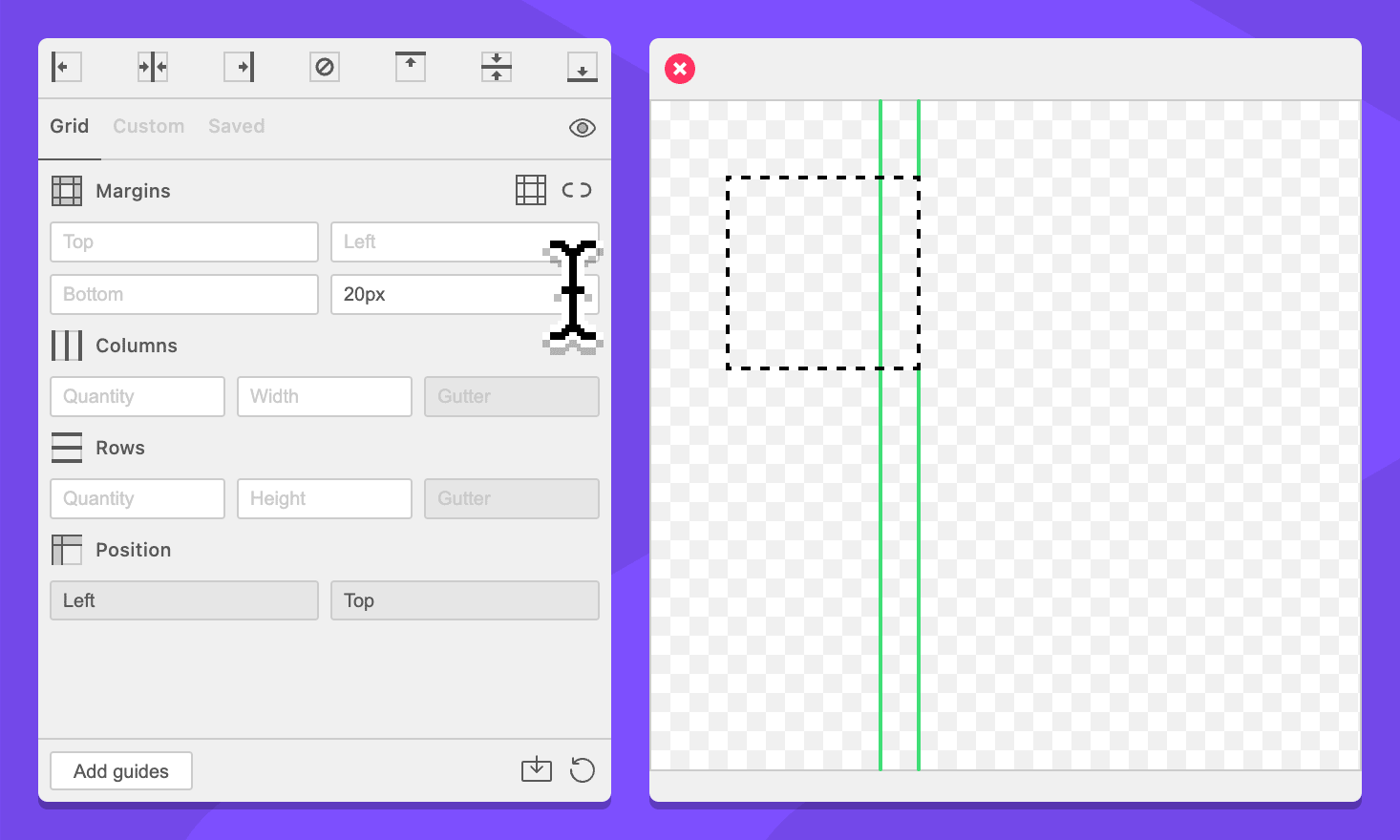
This field supports negative values and simplified grid notation. Commands are interpreted right to left.
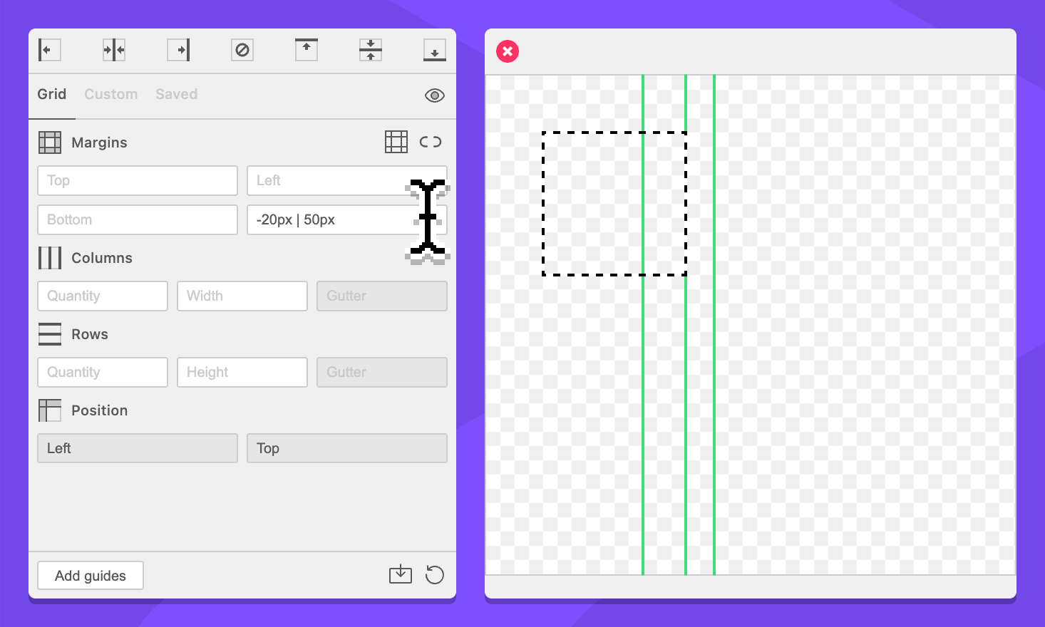
Button: / Toggle Border Guides
When enabled, the border guides setting will create a guide on the outside of margins.
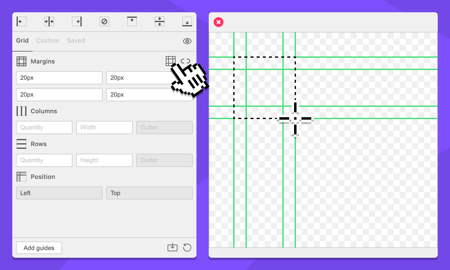
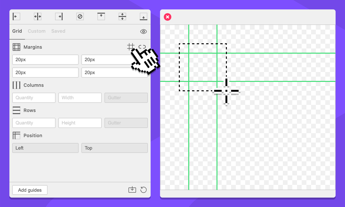
Button: / Sync Margin Fields
When disabled, typing in a margin field will only update that margin field.

When enabled, typing in a margin field will enter the value in all margin fields.
Columns
Field: Column Quantity
Specify the amount of columns for the grid. This field accepts integers greater than or equal to 1.
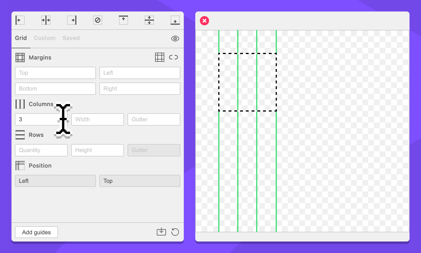
Field: Column Width
Specify the size of each column.
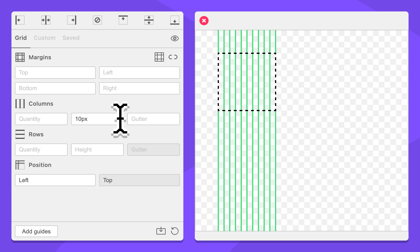
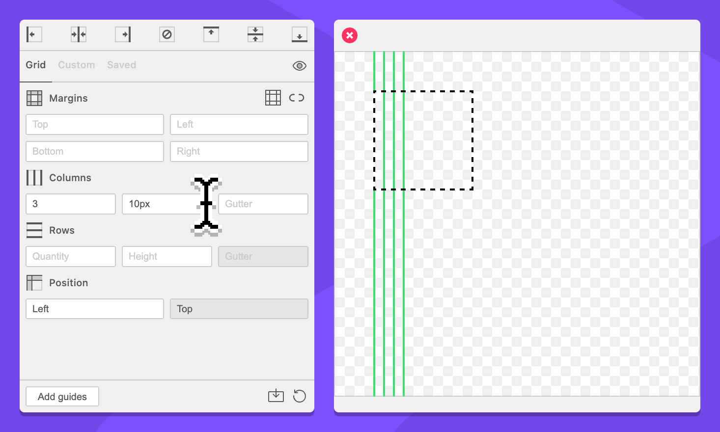
Column count can be used to define how many columns of each width will be included.
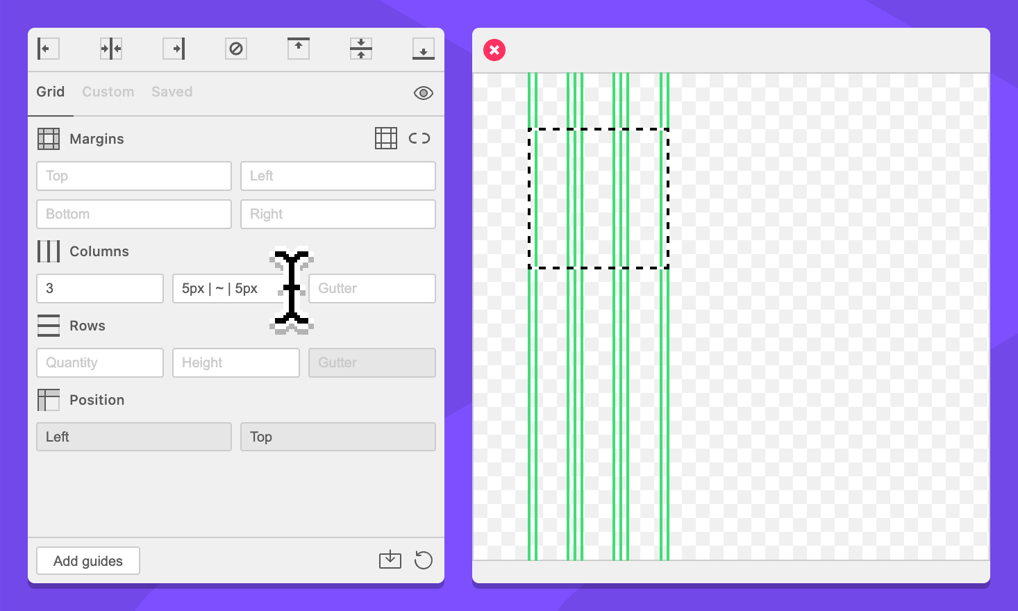
This field supports simplified grid notation.
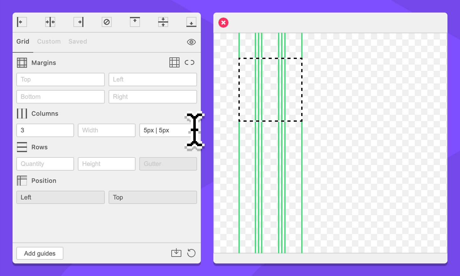
Field: Column Gutter
Specify the space between each column. A column quantity or size is required to enable this field.
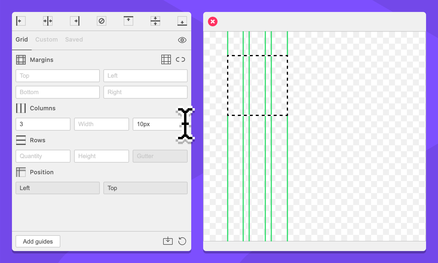
This field supports simplified grid notation.
Rows
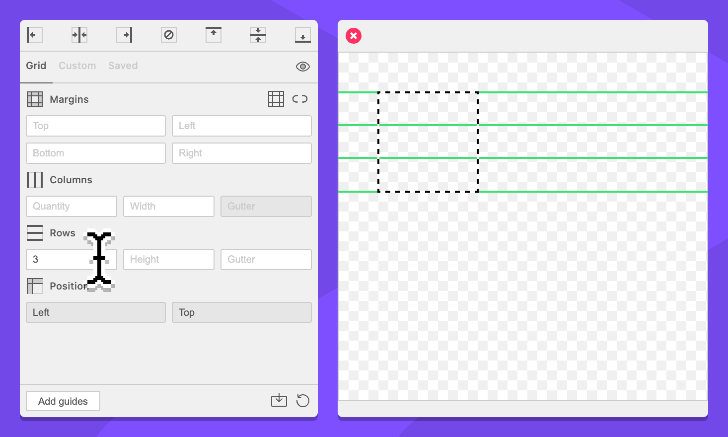
Field: Row Quantity
Specify the amount of rows for the grid. This field accepts integers greater than or equal to 1.
Field: Row Height
Specify the size of each row.
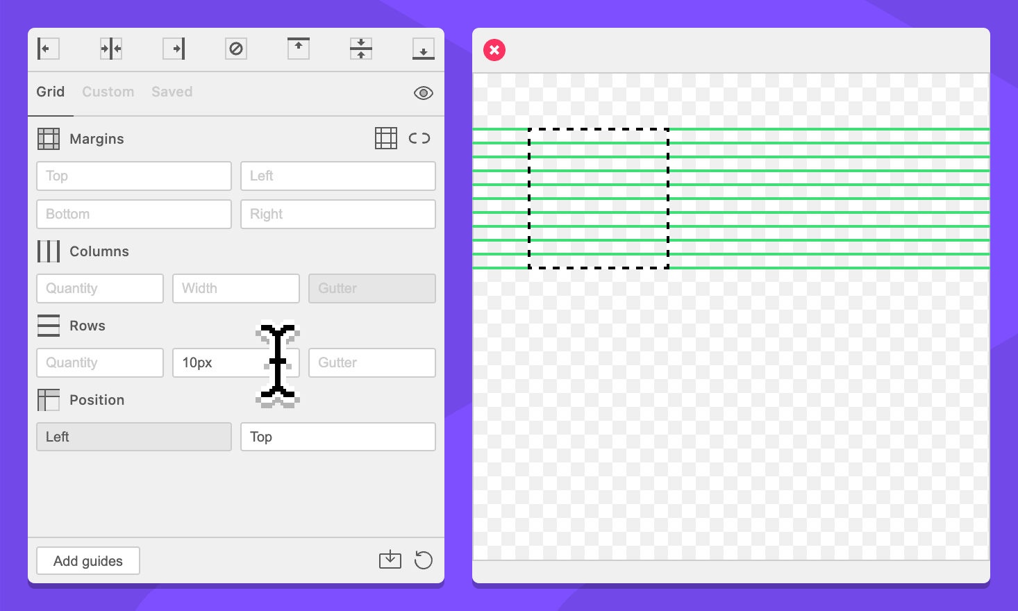
Row count can be used to define how many rows of each width will be included.
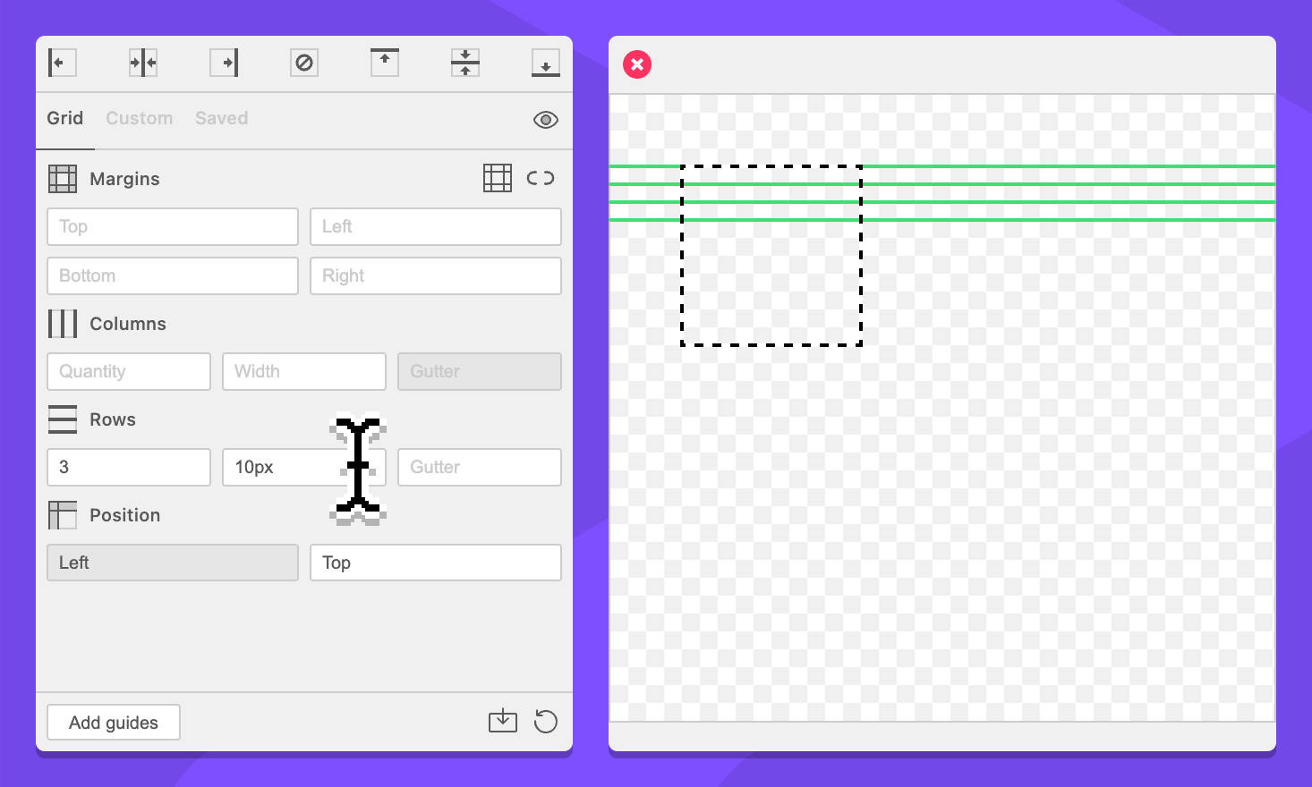
This field supports simplified grid notation.
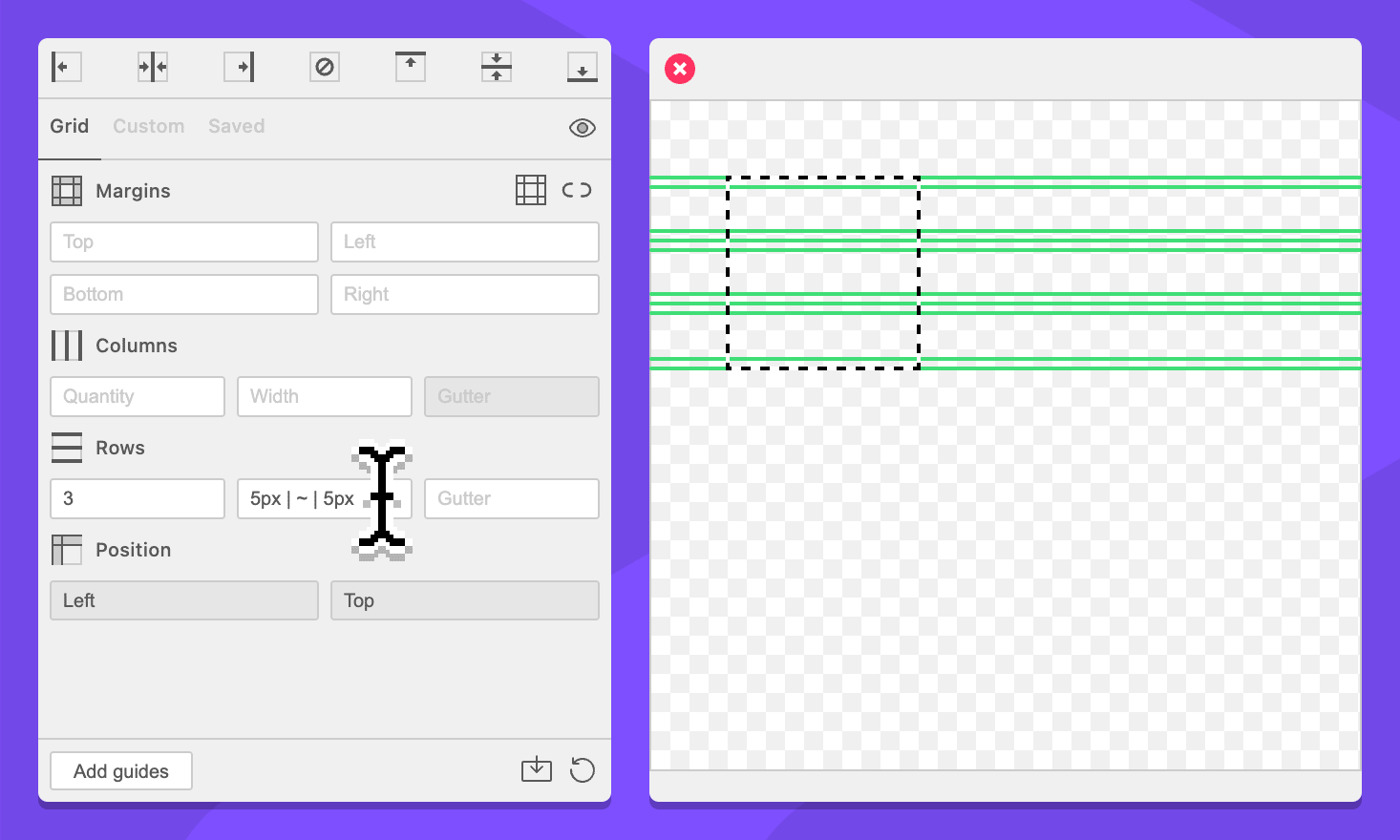
Field: Row Gutter
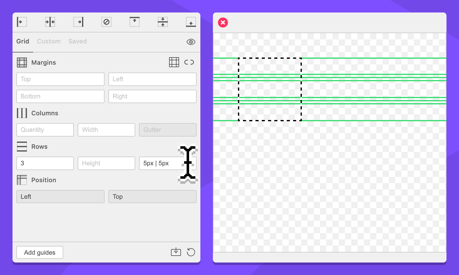
Specify the space between each row. A row quantity or size is required to enable this field.
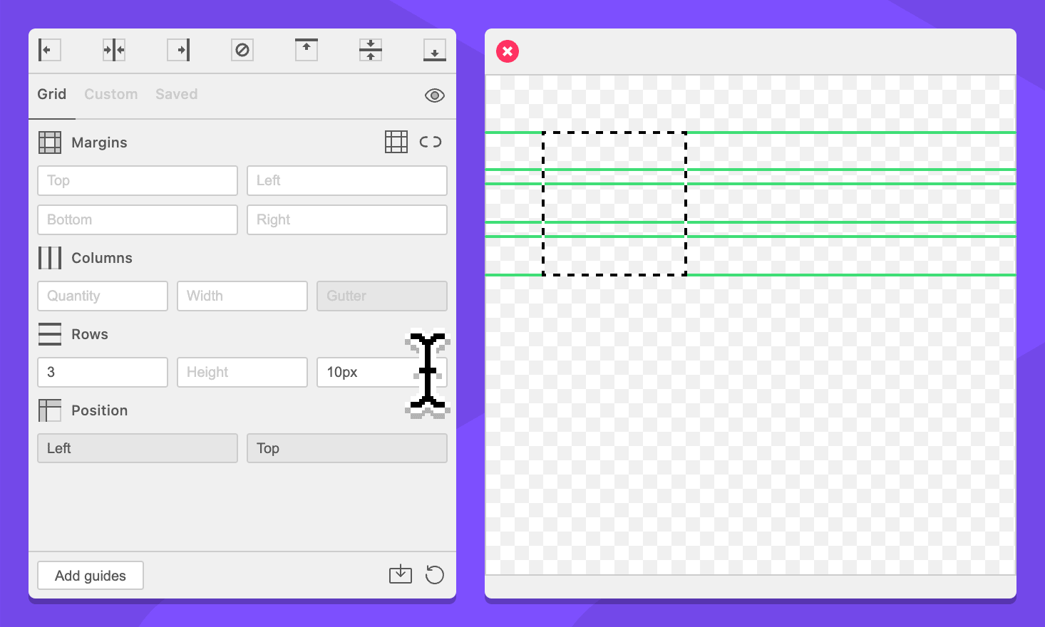
This field supports simplified grid notation.
Position
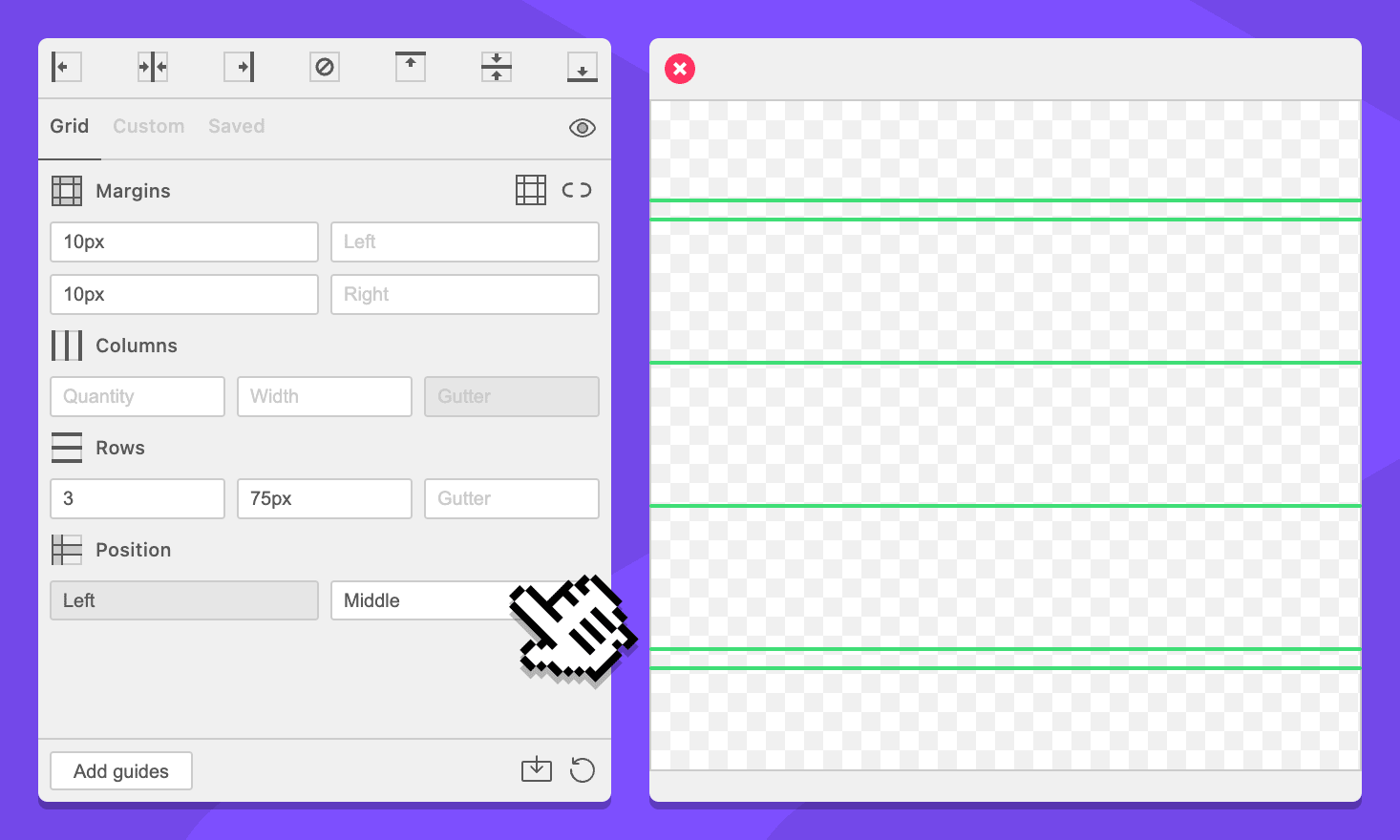
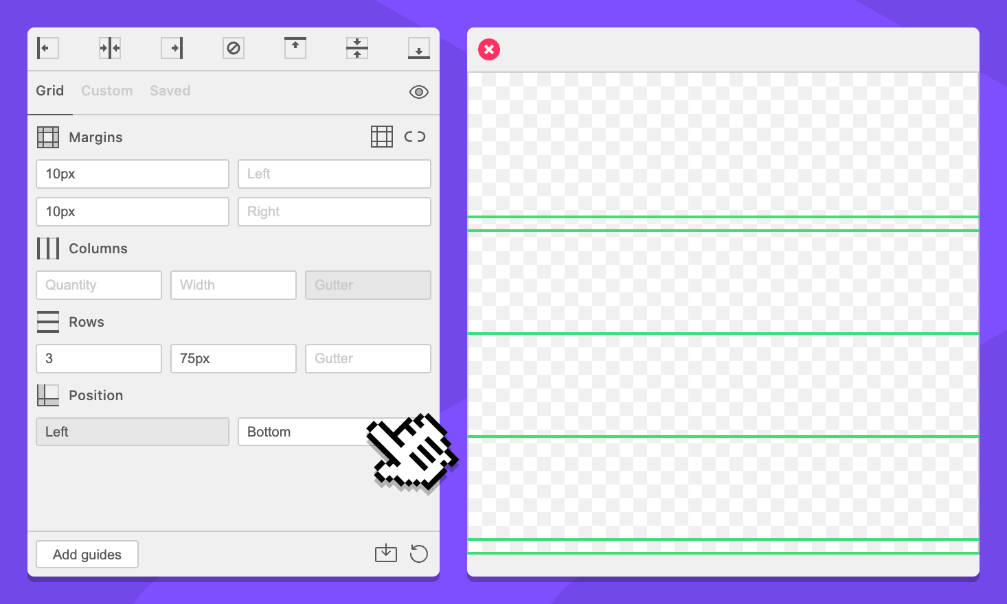
When the values of the form create a grid that is smaller than the available space, the position dropdowns determine where the grid will be distributed. Margins are placed relative to the edge of the grid, not the available space.
Dropdown: Horizontal Position
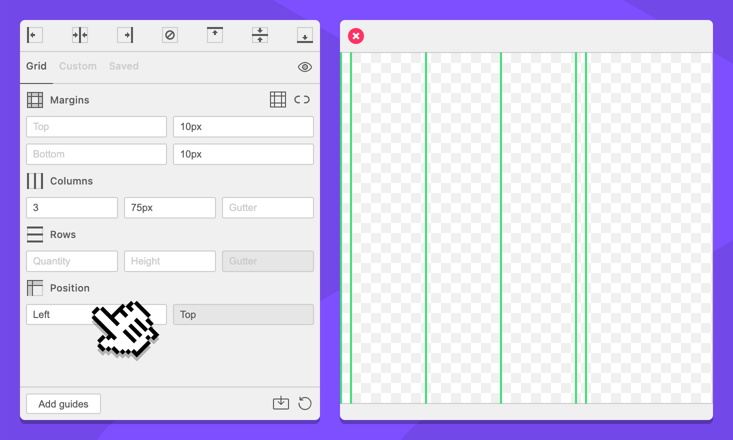
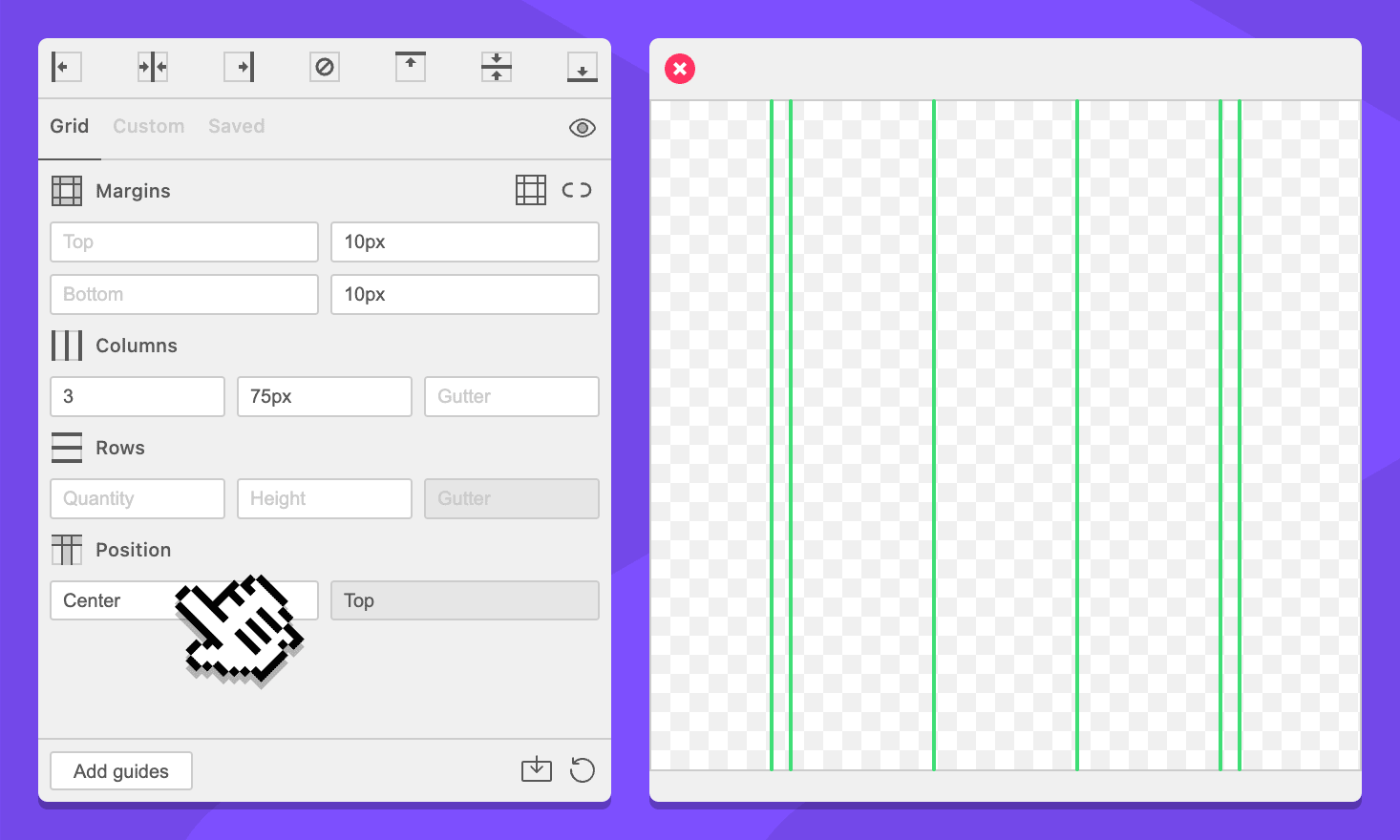
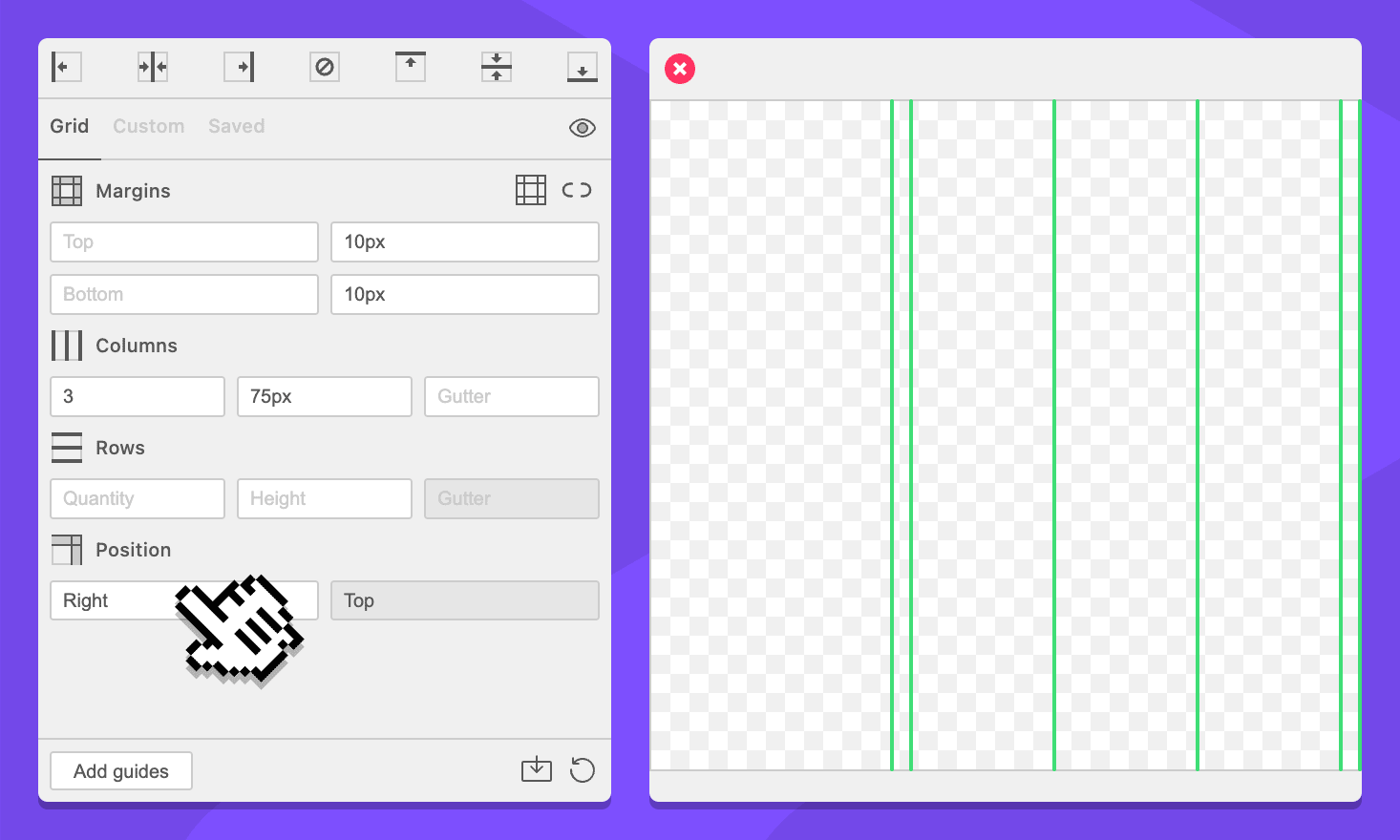
Specify were the grid will be horizontally placed.
Left:
Center:
Right:
Dropdown: Vertical Position
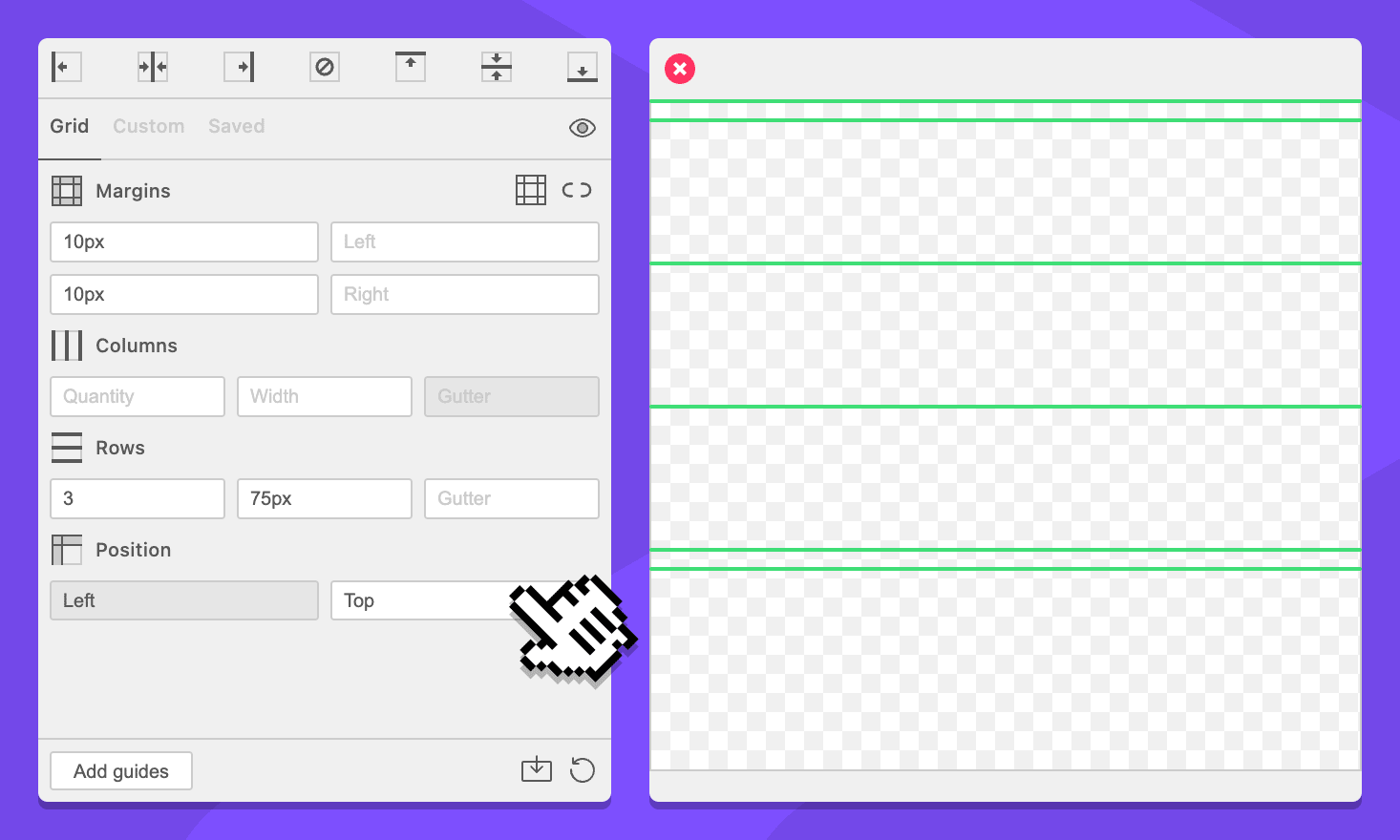
Specify were the grid will be vertically placed.
Top:
Middle:
Bottom:
Action Bar
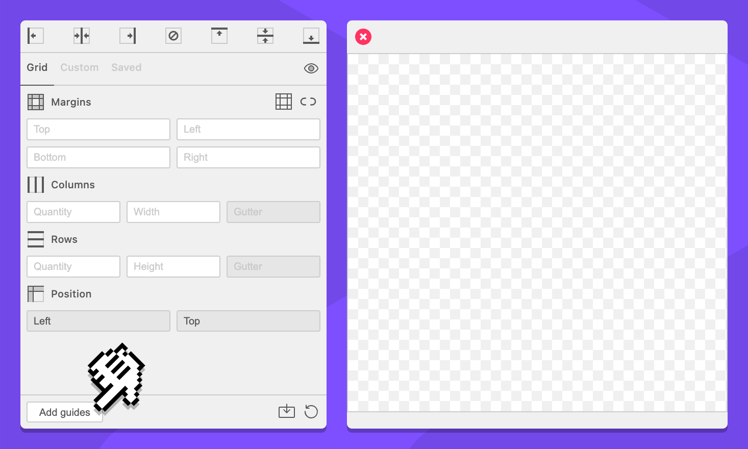
Button: Add Guides
Clicking this button will cause GuideGuide to calculate your grid and add guides to the document.
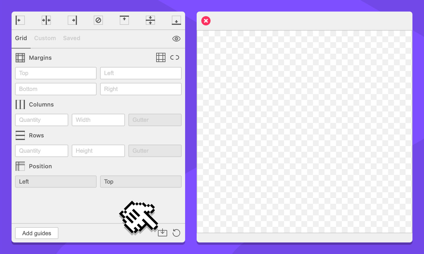
Button: Save Preset
Clicking this button will put GuideGuide into edit mode. In edit mode, GuideGuide will be able to save or edit a preset.
Button: Save Preset
Clicking this button will save the current edited preset. This button only appears while creating or editing a preset.
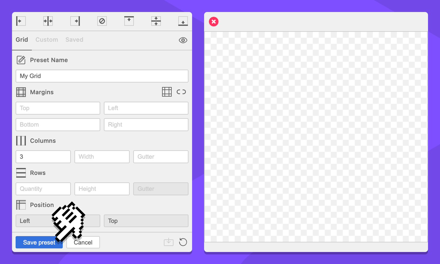
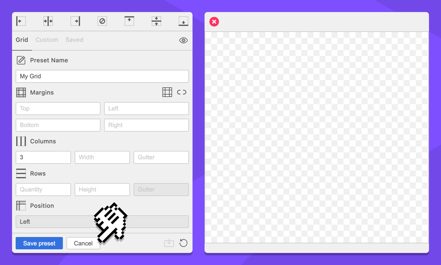
Button: Cancel
Clicking this button will cancel the GuideGuide edit mode. The form values will not change when edit mode is canceled. This button only appears while creating or editing a preset.
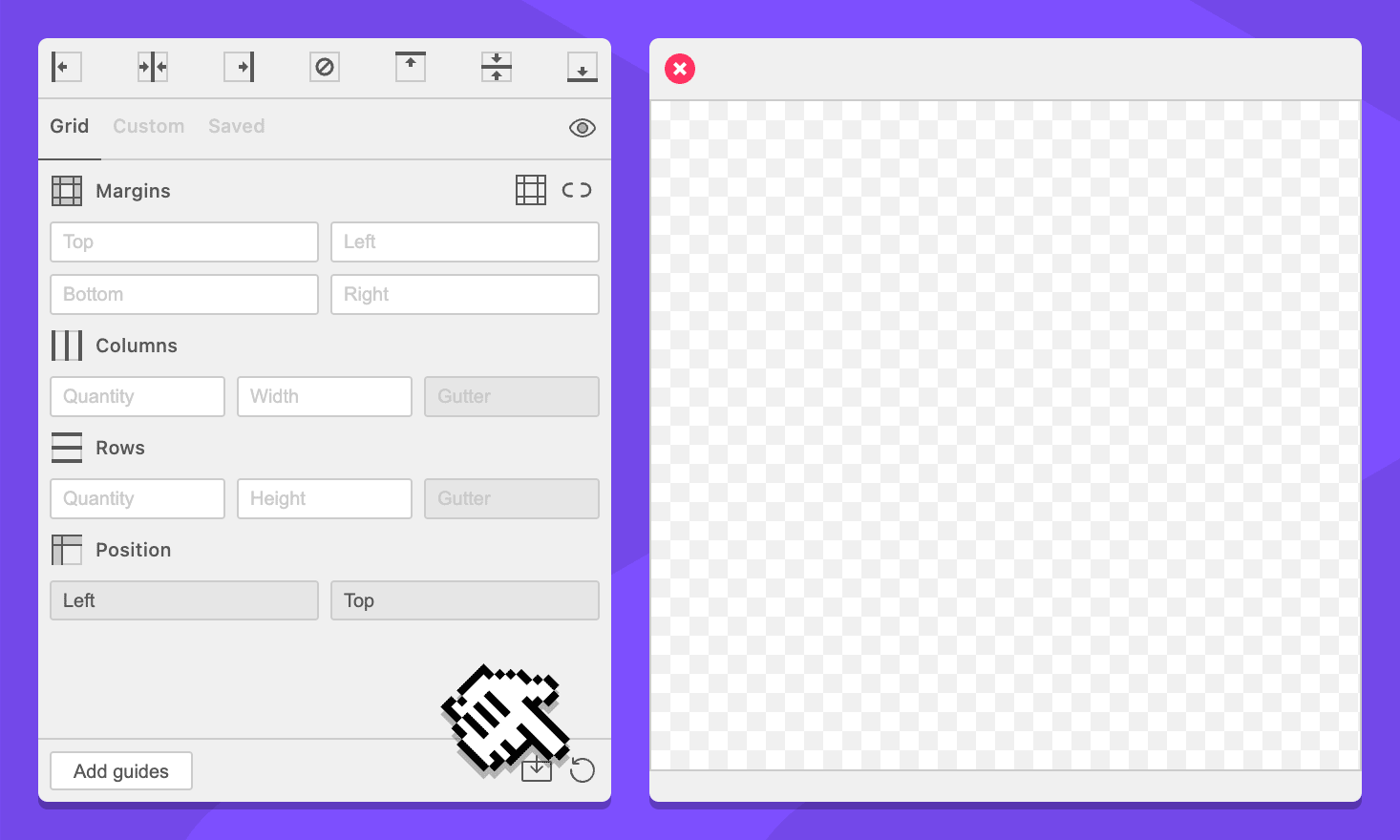
Button: Reset Form
Clicking this button will remove all values from the form.
Simplified Grid Notation
Unit input fields support a subset of Grid Notation commands which can be used to split the given field up into multiple sections.
For example, the following simplified grid notation in the column width field will create columns that have 20 pixel padding:
40px | ~ | 40px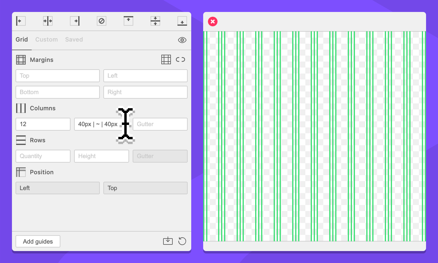
Simplified grid notation commands include unit commands, wildcard commands, and guide commands.
The following fields support limited grid notation: